
Brand book
CROSEC brand
The reference for every CROSEC asset: website, reports, decks, social cards and email. The colour values on this page are read from the live site stylesheet, so what you see here is what ships.
1. Logo
The logo is a globe mark with the CROSEC wordmark set across it. The globe carries the cross-border meaning; the wordmark is part of the artwork and is never re-typeset.


Icon / favicon
Where the wordmark would be illegible: browser tabs, app icons, avatars.
Download PNGClear space
Keep free space around the logo equal to the height of the letter C in the wordmark, on all four sides. Nothing enters that zone: not text, not rules, not image edges, not other logos.
Minimum size
32 px tall on screen, 12 mm in print. Below that the globe detail fills in and the wordmark stops resolving. Use the icon instead.
Never
- Re-typeset the wordmark in another typeface. Always use the supplied artwork.
- Recolour the mark to anything outside Navy, white, or solid black.
- Place the navy mark on a dark ground, or the white mark on a light one.
- Stretch, skew, rotate, outline, or apply a drop shadow.
- Crop the globe or separate it from the wordmark in the primary lockup.
- Set the mark on a busy photograph without a solid or heavily dimmed panel behind it.
2. Colour
Navy is who we are; teal is what we ask you to do; cream is the warmth that keeps it human. Indigo is a scalpel, not a brush.
CROSEC Navy
#011A43 rgb(1, 26, 67) var(--navy) The primary brand colour, taken directly from the logo. Headings, dark grounds, the hero, the footer. If only one colour is available, it is this one.
Navy Light
#0A2A5C rgb(10, 42, 92) var(--navy-2) Gradients and depth on navy grounds. Not for text.
Navy Deep
#061334 rgb(6, 19, 52) var(--navy-3) The heaviest ground: footer, and full-bleed panels sitting beneath a navy section.
CROSEC Teal
#00827A rgb(0, 130, 122) var(--teal) The action colour. Buttons, links, eyebrows, rules. Signals "do something here". Never use navy for a primary button.
Teal Bright
#00A08F rgb(0, 160, 143) var(--teal-2) Hover states, and teal used on navy grounds where the base teal is too dim.
Teal Deep
#00655F rgb(0, 101, 95) var(--teal-3) Pressed states and teal text on cream, where contrast needs to lift.
CROSEC Cream
#F5E5D5 rgb(245, 229, 213) var(--cream) Primary text and figures on navy. The warmth that stops the brand reading as generic corporate blue.
Cream Muted
#EDE5DD rgb(237, 229, 221) var(--cream-2) Secondary and body text on navy grounds.
Cream Tint
#FAF4EE rgb(250, 244, 238) var(--cream-3) Warm surface on light grounds: alternating sections, callouts, form panels.
CROSEC Indigo
#5346E8 rgb(83, 70, 232) var(--indigo) Emphasis only: a highlighted phrase, or a data point that must be seen. Never a button, never a large fill. If it appears more than once per screen it is being overused.
Carbon
#121111 rgb(18, 17, 17) var(--carbon) Near-black for photography treatments and print. Not a substitute for Navy.
Proportion
Roughly 60% neutral ground (white or cream tint), 30% navy, 10% teal. Teal earns attention by being scarce. If a layout has five teal elements, four of them are wrong.
Contrast (measured)
WCAG AA needs 4.5:1 for body text. These are the real numbers for the pairings this brand actually uses:
| White on Navy | 17.07 | AAA |
| Navy on Cream Tint | 15.64 | AAA |
| Cream on Navy | 13.86 | AAA |
| Teal Deep on white | 6.94 | AAA |
| Indigo on white | 6.16 | AA |
| Teal Bright on Navy | 5.22 | AA |
| Teal on white | 4.69 | AA |
| Teal on Cream Tint | 4.30 | Fails |
The one trap: Teal on Cream Tint falls just under. On any warm surface, alternating sections, callouts, form panels, step teal text down to Teal Deep. The site does this automatically; carry the same rule into decks and reports.
3. Typography
Headings and display
Source Serif 4
Semibold 600 and Bold 700 only. Report titles, section headings, pull figures, research list titles. Drawn for screen, so it stays robust at small sizes where a higher-contrast serif would go spindly. It carries full tabular figures, which is what a body publishing percentages and currency in tables actually needs.
Interface and body
Public Sans
Regular 400, Medium 500, Bold 700. All body copy, navigation, buttons, captions and the wordmark descriptor. Open apertures and neutral texture, so it sets long research prose without fatigue and does not compete with the heading face.
Fighting commerce crime
Fighting commerce crime
Retailers fight fraud alone. That is the problem.
Fraudsters exploit the gaps between retailers.
Retailer-led
Both faces are free and available from Google Fonts, so decks, documents and
the site match without licensing. Where neither is installed, fall back to
Georgia for Source Serif 4 and Segoe UI or Helvetica for Public Sans.
Tracking. Source Serif 4 is already tightly kerned: leave display sizes
at 0. Open small headings and table headers to .01em so the serifs do not
touch. Figures. Use font-variant-numeric: tabular-nums in
any table or column of numbers so percentages and currency align.
4. Voice
CROSEC is a working association, not a supplier. The writing should sound like a practitioner talking to a peer: specific, unhurried, and willing to say what we do not yet know. Claims carry numbers. We never sell.
| Say | Not |
|---|---|
| Retailer-led | Industry-backed, cross-industry |
| Free for retailers, permanently | Free to join (implies a paid tier later) |
| Association, member, participant | Platform, customer, user, subscriber |
| Anonymised, aggregate, category-level | Anonymous, shared data, pooled records |
| Threat intelligence, benchmarking | Solution, product, offering |
The three sentences
Every CROSEC asset should be reducible to these. Retailers fight fraud alone. Coordination is the fix. Membership is free, permanently.
Naming
CROSEC in full capitals, always. On first use in formal documents, expand once: Commercial Retail Online Security & Economic Crime Association. Never "Crosec", "CroSec", or "the CROSEC".
5. Application
Social / OG card
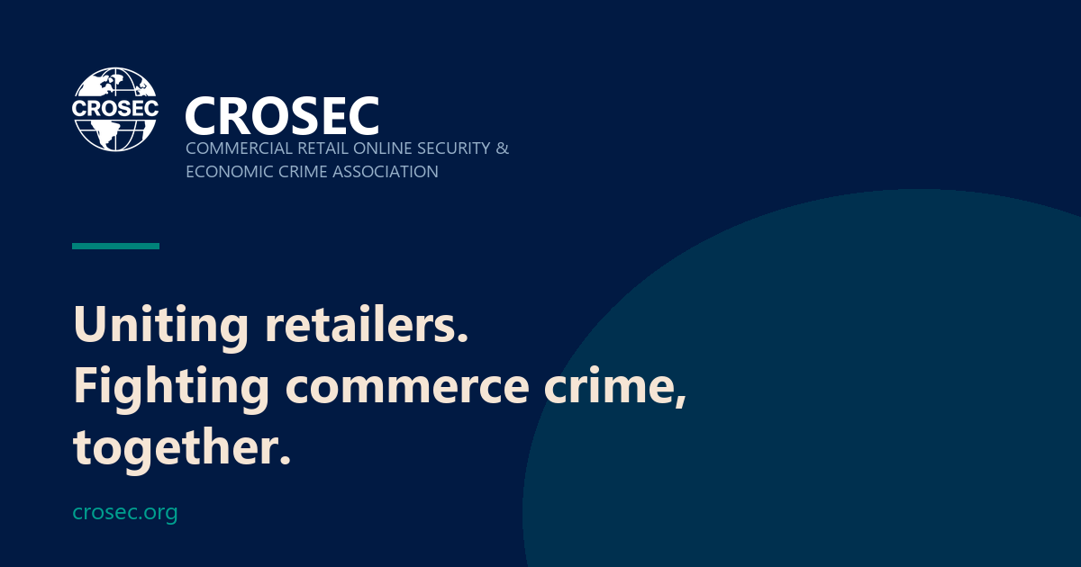
1200 × 630. Navy ground, teal wash lower-right, white logo lockup top-left, cream headline, teal URL. Every published article needs one.
Reports & decks
Cover
Navy ground, white logo lockup, Source Serif 4 title in cream, month and year in Public Sans. The teal rule sits above the title.
Interior
White ground, navy headings, black body, teal for charts' primary series and for callout rules. Cream Tint for pull-quote panels.
Charts
Teal is series one, Navy series two, Indigo series three, then greys. Never rely on colour alone, label directly.
Where these values live
Every colour on this page is defined once, in src/styles/global.css
under :root, and referenced everywhere else as a variable. Change
a token there and the whole site follows. Do not hard-code hex values into
components, if a colour is needed that is not on this page, it should be
added here first.